
When I was kid, I was obsessed with 2 things; monkeys and space. Since I couldn’t become a monkey, I figured an astronaut was the next best thing. Luckily I found common ground for both interests in NASA. Obviously the astronaut plan didn’t pan out, but I still have an appreciation for their logo, which happens to have a pretty interesting design evolution history.
![]()
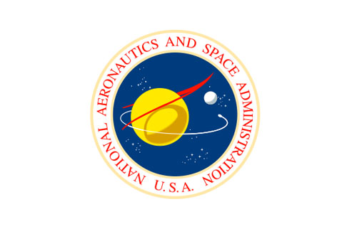
In 1959, a seal design was created in house by an illustrator at the Lewis Research Center. The design featured a yellow circle, representing a planet, a red airfoil and an orbital design. Due to difficulties reproducing the logo, it was later simplified to the mark we know today, which is lovingly referred to as “the meatball”.
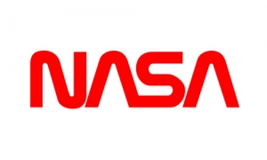 In 1974, NASA was fed up with their still hard to reproduced logo, and commissioned designers Richard Danne and Bruce Blackburn to replace the current NASA logo with a cleaner more modern design. The design was a simple one color acronym affectionally referred to as “the worm”, because of the long curving lines.
(For anyone else who wants to geek out on part of their design process, you can see the original 1975 graphics standard manual here.)
In 1992, NASA announced a return to the original design which is what is in use to this day.
There is a definite split of opinions among the designer community on which logo works best. I may be in the minority, but I’m drawn to the “meatball” logo most of all. By most technical design standards, the “worm” logo can be seen as the better option. The shape is simpler and easier to read and reduce, the single color works in all applications, it is by all accounts a great logo.
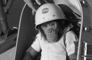 But something keeps me going back to the original design. Yeah, maybe it’s a little clunky or a little busy but it also has a lot of history behind it. I don’t know if it’s the nostalgia of seeing this logo on the on all of spacecrafts I would see on family trips to the Marshall Space Center as a kid, or maybe it’s just that chimps only ever wore the first logo.
The meatball is what I immediately think of when I think of NASA.