
As designers, we constantly think of how things will be reproduced as we’re working on a design.
Being in this mindset, I recently noticed that often the first time a client thinks about this is when it’s time to look at printing prices. I thought I’d take a minute to try and clear up any confusion and make choosing what works for you as easy as possible.
When we are talking about types printing for our work, it is mainly about using “process” colors or “Pantone” colors.

Process colors will be what people are most familiar with. This is what you see in magazines, newspapers and even your home printer. If you look closely, you will see the tiny dots of color which make up an image. Process, also known as CMYK printing, uses cyan, magenta, yellow, and the “key color” black ink to make these dots. Visually, the dots blend together and create the colors and images that you see. Although this process works great for photography and showing wide color variations, it does have its limitations.
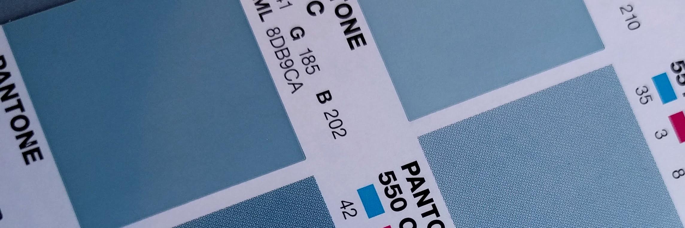
Pantone colors, also known as spot colors or PMS(Pantone matching system)is a system which gives a numerical name to a set of colors. Designers and printers purchase swatch books from the Pantone corporation, and this gives the printer a way to mix these exact colors.
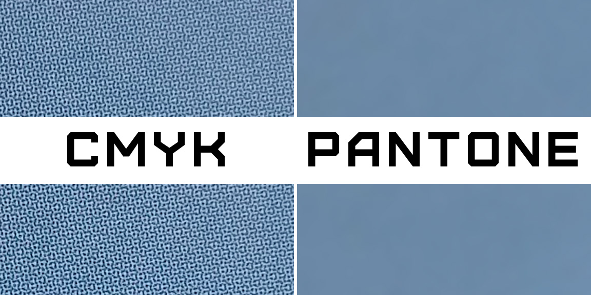
For certain applications, Pantone colors have many advantages. If consistency is vital, Pantone colors give much less room for error since you are using 1 color across all pieces rather than the 4 color build from process colors. Pantone can also provide much crisper lines than the CMYK alternative. If you were to print color text or a logo with CMYK, they will have slightly fuzzy edges where the tiny dots come together to make the color, whereas the Pantone will give a perfectly crisp edge. Pantone colors also give you many options that are impossible when using CMYK, such as using metallic inks.
Pantone colors do have their limitations though. If you are creating something with many colors, it will become much more expensive and photographic pieces are better left to CMYK.
Although it’s not exactly the most exciting subject, it can really make a difference if you choose the best options for your print pieces.