
We all know when it comes to design… Typography is important. Like REALLY important.
Whether you are designing for print or web, figuring out your typographic aesthetic and hierarchy is one of the most important steps to any design. One typographic tool that has been making life easier for designers and developers for as long as I have worked at Thunderstruck is Google Fonts. So what makes it so great?
Google Fonts is a web-based font directory housing hundreds of free and Open Source typefaces. The typefaces are created by designers from around the world and are tested to be used in more than 135 languages. The open source license means you can use any Google Font for any project personally or commercially, in print or digitally. Google takes care of hosting and licensing all of its’ fonts making sure everyone has easy access to beautifully designed fonts with no need to manage fonts within your own site.
Previously, developers and designers would have to stick to classic fonts like Arial or Verdana to make sure the website or email’s live text would display properly across all email clients and browsers. Because designers would have to choose from a limited list of “typical” web safe system fonts – it often meant making sacrifices in brand guidelines to favor function on the web. Incorporating google fonts into your brand means you can now easily maintain brand consistency and function.
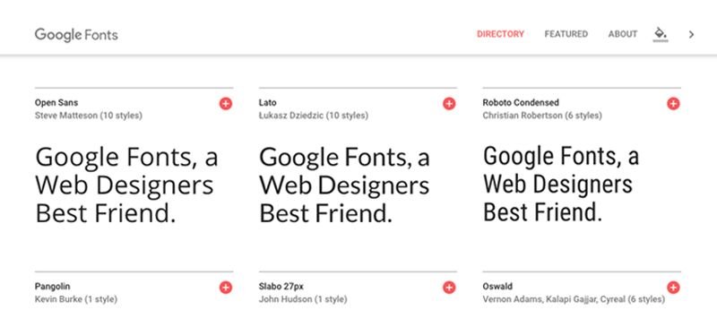
I have noticed that the quality of fonts keep increasing and the new Google Fonts interface that launched earlier this year (seen in the image above) makes it even easier to browse fonts. This is why it is definitely one of my favorite design resources available and the first place I look when trying to decide upon a font for a new project.
Check Google Fonts out for yourself at fonts.google.com