
Typography is one of the main driving forces behind design.
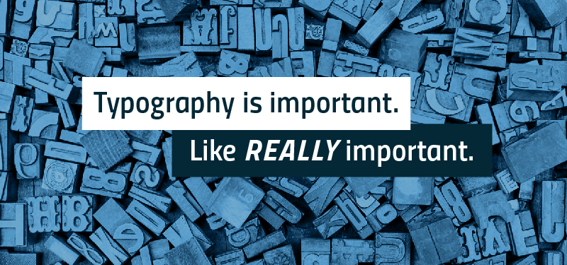
I know I have mentioned in the past, but when it comes to design… Typography is important. Like REALLY important.
Typography is basically the art of selecting and arranging type. There was a time where designers would only have a few fonts to choose from, but now that there are thousands of fonts readily available – font selection can be daunting. Most people never think about typography and do not understand the psychological effect can have on conveying your message. Proper typeface choice is essential to good design – You wouldn’t use Comic Sans if you expect to be taken seriously.
[Speaking of Comic Sans] There are a few fonts out there that designers, like me, love to hate. Often this is due to the popularity or over use of the font, its overall ugliness, or both. A few examples:
- Comic Sans – Unless you are writing a children’s comic book….Just don’t.
- Papyrus – This is a very stylized type and is used WAYYY too much and is very seldom an appropriate choice.
- Bleeding Cowboys – For the love of all things holy, please don’t ever use this font.
- Blackoak – This is so wide and bulky making it not very legible. I just can’t see how this would be a good choice, like ever.
- Brush Script – This font is a handwriting wannabe. Its not formal… Its not fancy… and its not fun.
- Hobo – This font is old… but not in a classic way. Can we just retire it please?
- Bank Gothic – Oh hey, its that font used for all action movies.
- Lobster – Can we stop with the Lobster please?
- Zapfino – Unless you are Zorro inviting us to a fancy dinner, skip this one.
- Trajan – Oh hey, its that font used on every other movie poster, ever.
- Curlz – I mean, do I even need to explain this? U-G-L-Y, Curlz ain’t got no alibi…
- Arial and Times New Roman – Nothing says student research paper like these two. They are overused and boring. Using these in design is like a lazy cop out.
I could seriously go on forever ranting on fonts I hate. Instead, I will leave you with on a positive. I’ve noticed that now, more than ever, people are becoming aware of typography and design. Especially when it comes to bad font choices. A great example of this can be seen in a recent skit from Saturday Night Live.